make a little spark
album & release cycle branding for funkrust brass band
how it started
Funkrust Brass Band, NYC’s premier post-apocalyptic brass band, has returned with their third recorded album. The album, entitled Make a Little Spark, explores hope and despair, anger and joy, utopias and dystopias through the lens of science fiction, steampunk, alternate futures, and other mysteries. Through it all, a theme emerges: joyous collective resistance in the face of adversity.
And they asked me to create artwork that would sum all that up.
Not only that, but to support this album, the band planned an ambitious Kickstarter campaign to engage fans and cover the costs of production. So in addition to artwork that encompassed the experimental themes of this new album, they also needed social media graphics, Kickstarter campaign assets, and merch designs for the upcoming release cycle.
Research
a deep dive
After listening through the album a couple dozen times and getting some of my initial thoughts down on paper, I dug through Funkrust’s previous album covers and their merch designs (shown above) to see how we could pull from the past while still moving the band forward.
I knew I wanted the artwork to retain a hand-printed quality. In Funkrust lore, the band exists in a post-apocalyptic future without electricity and they make music through archaic means — like with brass instruments and megaphones. So it was fitting to make the artwork in a similarly antiquated way, like protest signs or posters from the legendary Bread and Puppet Press.
I also looked to tarot and religious iconography for symbolism to represent the more grandiose themes in the album. With song titles like “Kill Yr Idols,” “What is Sacred,” and “Prayer of Resurrection,” the spiritual symbolism didn’t seem like too much of a stretch.
concept sketches
I presented three ideas to the band. The first used stained glass to play into the subverted religious themes running through the album. The middle sketch leaned into the neo-folk style with a strong hand-carved look and feel. The last sketch was a simple design using a molotov cocktail, a direction requested by the band. The band members agreed the second sketch was the most on brand for the band’s past, present, and future, and I was given the green light.
digital rendering
As you can imagine, carving a block by hand is hard work, and there’s no undo button. I need to know how everything is going to look — and it’s especially important that my client is on board — before I pick up my chisels. So I create a digital rendering of the artwork, figure out all the details, and get the stamp of approval from my client before moving onward.
It also gives me a chance to think through all the symbolism, and there’s a lot here. Ready to dive in?
Starting in the middle, the megaphone acts like a call to arms and the rest of the design radiates out from it. In the top corners are pigeons. Pigeons are a type of dove, and while white doves are seen as bringers of hope and joy, their iredescent cousins are seen as pests in cities. In their beaks, the pigeons are carrying dandelions, which are healing flowers that are often mistaken as weeds and wiped out. The dandelion seeds are floating in the air behind the pigeons, spreading joy & hope. Between the pigeons are waning moons transitioning through the new moon phase onto waxing. This phase is not just an ending but a new beginning. At the bottom, there are hands representing community and support, and flames are bursting from them. Tear drops represent despair. The lightning bolts are an iconic motif in Funkrust’s outfits and live performances. And then I made sure to pepper in a bit of sparkle, glitter, stars, and flames where ever I could.
Phew. That was a lot. Anyway, the band was stoked about this design, and I was stoked to move onto my favorite part…
making it with my hands
first i carve the design into the block.
then i roll ink over the surface of the block,
and Press paper on top to transfer the ink.
and then i show off the finished print!
Looks great, but the band didn’t ask for prints. They asked for album art, social media graphics, and merch designs. So we scan this artwork back into the digital realm and go from there.
expressions
digital album art
t-shirts
Embroidered Hats
Bandanas
Kickstarter Campaign Assets for Web
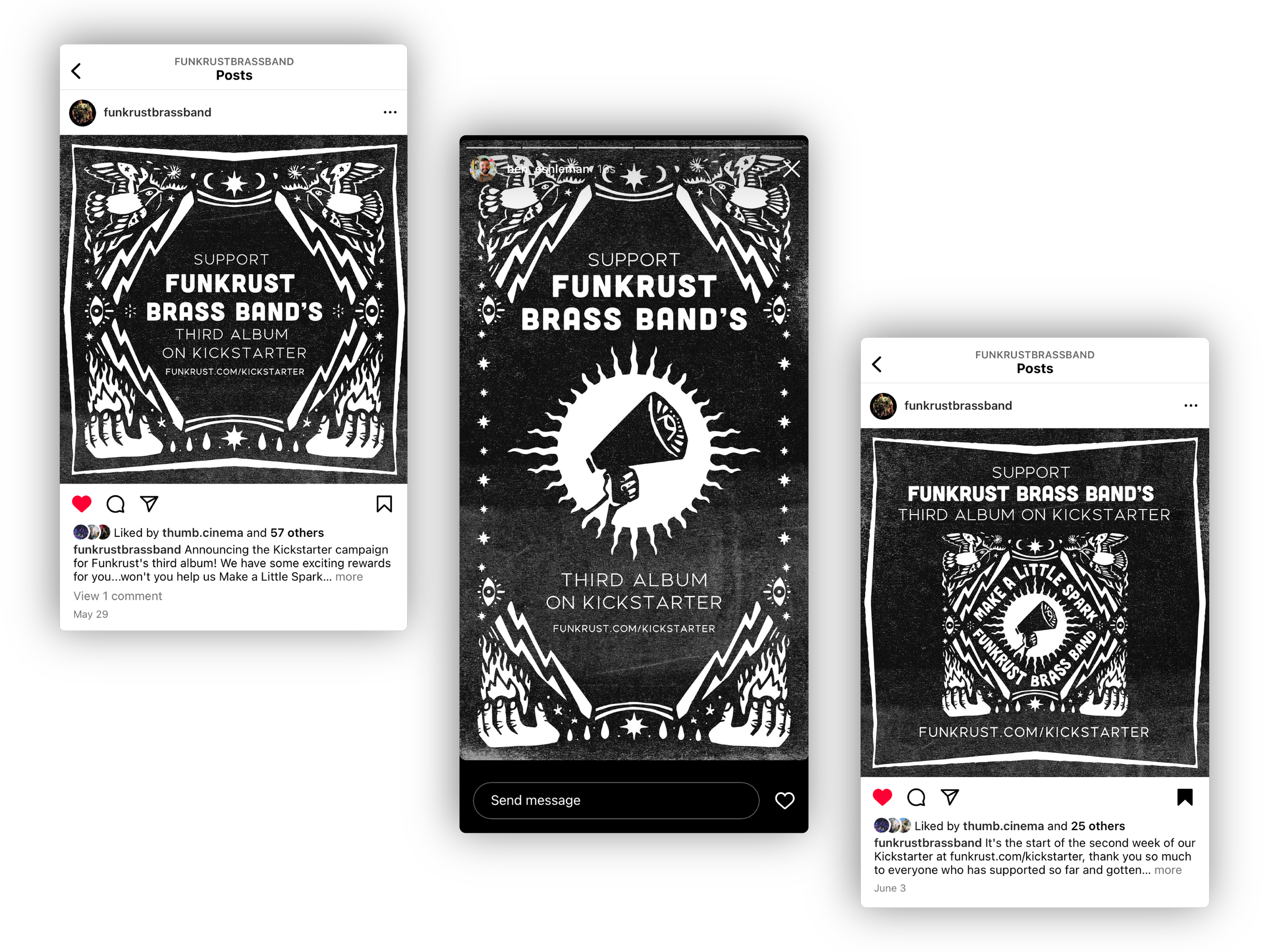
Kickstarter Campaign Assets for social
conclusion
This project was super rewarding for so many reasons. First, I’ve always wanted to design album artwork for a band, and after successfully infiltrating Funkrust and playing with them for 5 years, they finally let me do it. From a technical perspective, it was the largest block I’ve ever carved, coming it at 12” square. Turns out my home press can’t accommodate a block that large, so these also became the largest prints I’ve ever hand-printed.
And finally, the project was a big test of my process. When I started, I was wondering — could I really make artwork by hand, and make it work across social media, physical merch, and everywhere else this stuff needs to end up?
I found out the answer is yes. It’s an awful lot of work, but the result is a one-of-a-kind design made with traditional block printing techniques. And that’s pretty special.
Thanks for looking.


